Top 10 Most Disgusting QW Graphics
Making QuakeWorld open source later led to a new addition to the engines which allowed users to customize the look of the game in any way they wanted. You can have custom textures on walls and materials in game, custom particles, lots of parameters for effects, lighting, console font, head up display font and images, crosshairs, skyboxes, console background and so on. This lead to a new movement - QuakeWorld graphics or QuakeWorld GFX. Users like to customize their game very much and they do so.
However to cook the best meal ever you cannot just take the best ingredients available and put them together in one pot. Also to cook a delightful cake you don’t use the most burning red pepper available. The customization lead to a lot of dreadful combinations and this article is my pick of the top ten most disgusting QuakeWorld custom graphics I’ve ever seen.
10. Dining room perversion
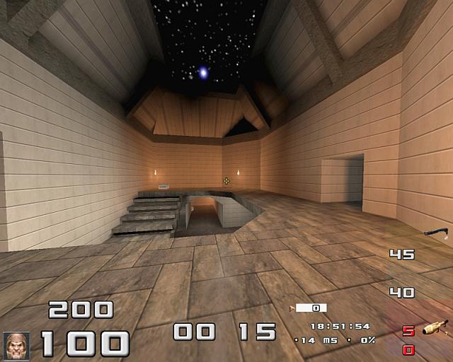
There you have it, nicely looking screenshot. Clean walls, clean floor, stars shining above your head. You could definitely have a dinner with some nice women in here, then a romantical walk under the stars in green armor area and then invite her to see the secrets you hide in the megahealth room (which I bet has a thick red carpet on the floor). But is this the place where you also gib your enemies to bloody chunks? It is not.
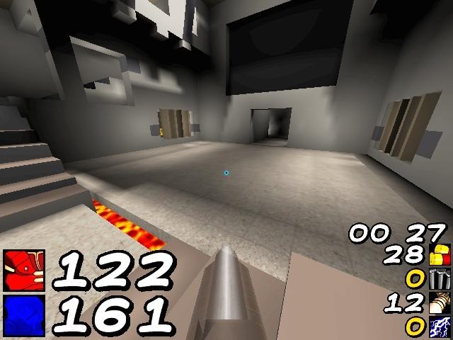
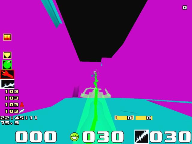
9. Max size, max visibility, max mud
The parameter gl_max_size allows you to reduce the details of the textures on the walls, but in Quake this variable should be renamed to “mudlevel” because of the overall effect it creates.
Now tell me which map this screenshot is from, try to guess in which direction I’m looking or how far I am from the nearest wall.
On this picture there is a soldier from the Vietnam War hiding. He has learned the skills of how not to be seen thanks to his khaki coloured pants, but he is in there, pointing his gun at you.
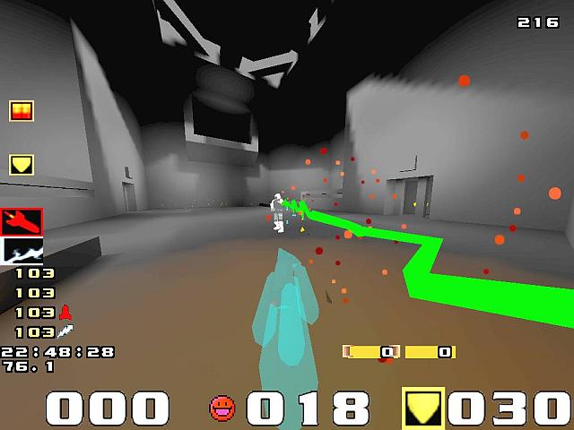
8. New lightning pliz
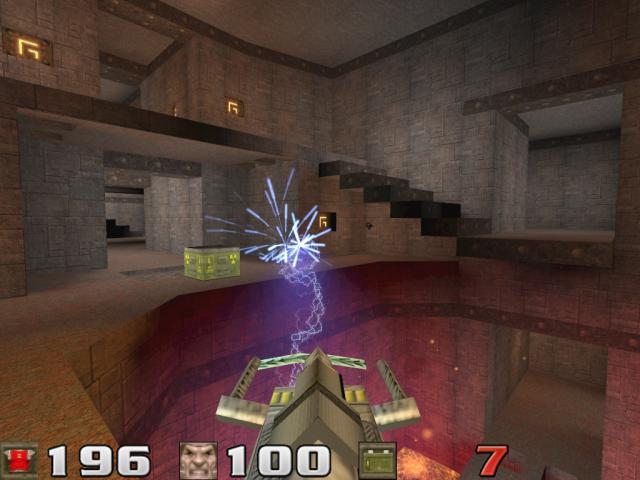
Now this is a screenshot that still resides in the official ezQuake screenshots gallery. But it is the combination of the three most horrible lightning gun related customizations. First of all the sparks look like a fireworks, not like a sparks from electricity. The shaft model itself is like from another game, the yellow stripes on the front side remind me the yellow-black stripes you usually see on dangerous places where you should be aware of something. Maybe this was supposed to warn everyone around that potentially a beam giving 300 damage per second can come out of this?
And finally, the beam itself, is the most misconfigured graphics setting ever. I swear every new movie that contained gl_particles_trail_detail set to 1, which makes this effect, made me cry. You are supposed to set that value to 100 which results to a beam faithful to the original Quake beam. This beam looks like if you touch it, it will just make your hair stand up but definitely it won’t damage you.
7. Oldschool nerd
Many people know Reppie and the game settings he is using. Now all of you who are not playing Quake since year 1996 but let’s say since 2002 or something, try to remember what were you thinking when you saw such screenshot first. Was it “Gah, that’s disgusting” or “Wow, maybe he plays so leet because of such l33t oldch00l settings … maybe .. if I try that I’ll get better in two days and in a month I’ll beat ParadokS in The Dark Zone OMG!!!”?
There are more people playing in such low-details software version of the client and all QW developers respect them and keep delivering software version of their clients. But is this REALLY necessary in year 2007?
6. From NC-17 to PG-13
The abbreviations in the heading represent the target audience for which a movie in the US is suitable for. The head up display font you can see on the screenshot was maybe a random pick you sometimes find on the most underground Quake forums or maybe it’s a piece of a project that aims on making this game very suitable for your kids. God knows. Also it’s not known what will happen to the blue cloud in the lower left corner after your health goes down. Oh. Did I say health? I mean your … magic points! You absolutely do not lose your health in this game and you definitely do not die.
5. The Bricken Place and The Bricken-o-polis
Things on these screenshot get very serious. After the action from the first screenshot is over, you’ll be able to hear someone saying “Sector cleared!”. I’ve heard that a bomb has been planted near yellow armor. Before you get there you are about to hide behind a crate for a few .. minutes. Such an old bricks just don’t belong to Quake. This is a Counter-Strike clone. “Affirmative!”
4. When there are no limits
This custom graphics didn’t reach the 1st place not because they are not enough disgusting. They are. Seriously. But in my opinion the person who made this really made it with the goal to be the most disgusting QW screenshot ever. Some of us wouldn’t ever imagine that such customizations are even possible. And because there was a clear intention, the guy simple knew what he or she is doing, I can’t give it the gold medal. But still, it is the (im)moral winner.
3. Barbie world
Maybe this was a branch of the project from one of the previous candidates which aimed to make Quake suitable for kids. Now it aims to make this game suitable for 4 years old girls. This screenshot wasn’t downloaded from Mattel.com, it’s the result of an elaborated evolution process. I’ve heard rumours that as an enemy skin the user of this customization uses the picture of Mr. Ken. In the green armor room there is a white romantic table where you drink tee with Shambler the monster, who is of course wearing a trimming pink skirt.
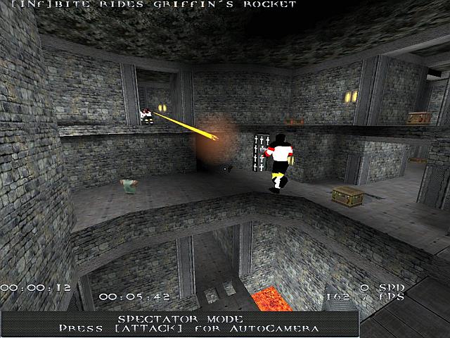
2. Big things
Owner of this customization has a big payroll, he owns a big house, a big car with a big engine and he also owns a big .. rocket launcher. And he is definitely proud of it.
However, this rocket launcher does not belong to QuakeWorld. This rocket launcher is big, but as it usually happens with guys who own big toys they are proud of, big toys sometimes do not do big things. The game this rocket launcher comes from calls Quad Damage something that only gives triple damage, so it’s no big surprise that this rocket launcher as we know actually launches rockets slower then the usual QuakeWorld rocket launcher. But of course, it is BIG. I give it a silver medal. A BIG silver medal.
1. The winner

Now if you look at this screenshot and you have no idea why it’s placed here as the winner or you even do not consider it disgusting at all, you’ve completely missed the message I was trying to bring you across. What is so immensely disgusting about this screenshot is the fact, that it is actually trying to look nice. And it succeeds, to some level. But it is a top representative of where sick graphics customization has gone. Again, we have old stone bricks that do not belong to QuakeWorld, and on the top of them there is a floor texture which looks like a surface of some modern spaceship. Bricks, spaceship. Hm. The texture of the borders of the teleport is some motif from the trails some army tank left behind. And finally, the texture of the teleport liquid looks like a microscope picture of some scientific biology experiment where bacteria breeding has gone very out of control. Oh lord. Some people should take a look at original Quake as it comes out of the box. Some reading about Shub-Niggurath and Lovecraft’s themes would also do just fine.
Long live Quake Retexturing Project.
So long, barbies.
- Written by JohnNy_cz
My shot made it to #4, thanks! ;D